Chart 1 — rolling mean severity score by county group
The chart your Chief Claims Officer should look at first. Where the silent C3 coastal-county divergence begins, in one visual.
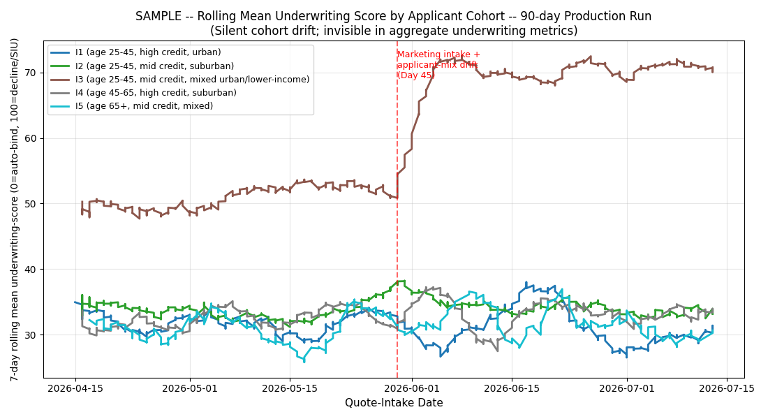
What you are looking at
- X-axis: Day 1 through Day 90 of the audit period
- Y-axis: 7-day rolling mean of the AI's severity score (0-100 scale)
- Each line: one county group (C1 Upstate, C2 Midlands, C3 Coastal, C4 Pee Dee, C5 Piedmont)
- Baseline window: the first 30 days establishes what "normal" looks like per county group
What the eye sees
Four county groups stay roughly parallel across the 90 days. One group — C3 — rises. The rise begins around Day 44, and it does not recover. The line separates from the pack, climbing toward the SIU-flag threshold at score 67.
This is the pattern a senior claims director instinctively recognizes: something in the coastal-county claim stream changed, and the AI is scoring it as higher severity + higher fraud-signal than baseline. The 14 percentage-point SIU-flag-lane-shift follow-on is the operational consequence.
What the sensor fires on
The sensor is not looking at the eye's pattern. It runs four quantitative thresholds against each 7-day window per county group:
- Mean-shift: is the 7-day mean > 1.5 standard deviations from baseline mean?
- Variance-ratio: is the 7-day variance > 1.5x baseline variance?
- KL-divergence: is the shape divergence between baseline and current distribution > 0.2?
- Group-differential: is the max cross-county-group shift > 12%?
Day 44 fires C3 KL-divergence 3.912 (roughly 20x the threshold). The pattern the eye sees is the pattern the sensor quantifies.
What regulators care about
The chart also tells the counterfactual story: had this monitoring been in place operationally, the drift window would have been ~5-10 days rather than 45+.
The next chart
The rolling-mean chart shows when. The baseline-vs-drifted chart shows how the C3 distribution shape moved.
$499 Snapshot. 3 business days.
Same 3-chart set for your carrier's actual AI surface + full analysis report.
Buy $499