Chart 2 — baseline vs recent severity-score distribution (C3 coastal)
The rolling-mean chart shows when. This chart shows how the shape of the C3 severity-score distribution moved from baseline into the SIU-flag lane.
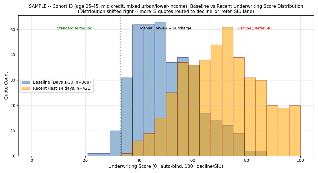
What you are looking at
- X-axis: AI severity score, 0-100
- Y-axis: density of C3 coastal-county claims at each score
- Baseline curve: Days 1-30, before drift onset
- Recent curve: Days 60-90, deep into the drift window
- Lane markers: vertical lines at score 33 (Fast-Close → Standard) and score 67 (Standard → SIU-flag)
What the eye sees
Baseline C3 was a roughly symmetric distribution centered in the Standard Adjust lane, with a modest tail past the SIU threshold consistent with the ~5% baseline SIU rate. Recent C3 has moved right. The central mass sits closer to the SIU threshold. A secondary bump has appeared in the 75-90 range. What was a 5% tail is now a ~19% tail.
This is a shape change, not just a location shift. Mean-only monitoring would notice a mild uptick. Shape monitoring surfaces the full picture — and the shape change is what drives the SIU-flag-lane operational consequence.
What the sensor fires on
KL-divergence between baseline and recent for C3 lands at 3.912 — roughly 20x the 0.2 threshold. This is the numerical way of saying: "these two distributions are not close." Combined with the mean-shift and variance-ratio thresholds also firing, the event classifies as high-severity.
Why this chart is the one plaintiff's experts use
The next chart
The shape shift explains why the SIU-flag rate rose. The lane-shift chart shows the resulting operational consequence per county group.
$499 Snapshot. 3 business days.
Same 3-chart set for your carrier's actual AI surface + full analysis report.
Buy $499