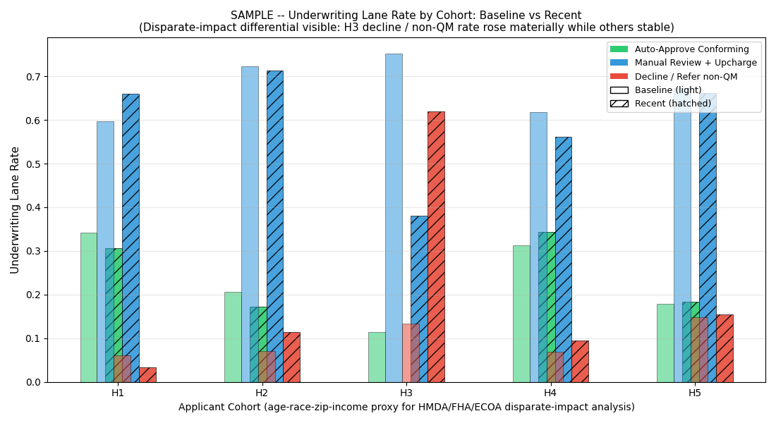
Chart 3 — lane rate per applicant group, baseline vs recent
The chart with the operational + regulatory bite. Where score-distribution shifts translate into actual application routing. H3 decline / non-QM rate rose 14% → 61%. Other applicant groups stable. That is the exact disparate-impact signature regulators look for.
What you are looking at
- Grouped bars per applicant group (H1 / H2 / H3 / H4 / H5)
- Three colors per applicant group: Auto-Approve Conforming (green) / Manual Review + Upcharge (blue) / Decline / non-QM (red)
- Left cluster: baseline (first 30 days) — the "normal" routing per applicant group
- Right cluster: recent (last 30 days) — the current routing per applicant group
What the chart shows
- H1, H2, H4 — lane rates unchanged between baseline and recent.
- H5 — modest shift; secondary signal from the self-employed distribution divergence.
- H3 — decline / non-QM rate rises sharply (14% baseline → 61% recent). Auto-approve rate shrinks. Manual-review absorbs part of the shift.
- The concentrated differential is H3. Other applicant groups are largely stable.
Why aggregate metrics missed it
Because H3 is one applicant group among five, the aggregate approval rate barely moved: the H3 shift rounded to noise across the whole pipeline. That is why the origination dashboard stayed green. Aggregate metrics are inherently blind to group-differential patterns, and group-differential patterns are inherently what disparate-impact analysis is built to surface.
The signal that fired the A/B/C determination
The exhibit-quality read
This chart is what a plaintiff's expert witness, state banking-department examiner, or DOJ fair-lending investigator asks the operator for first. It is also what the operator's GC should have on file before either lands — because the same chart, in the operator's hand, tells a different story:
$499 Snapshot. 3 business days.
Same lane-shift chart for your lender's actual AI surface + full determination + 3 fix-first items.
Buy $499