Chart 2 — E3 baseline vs recent distribution
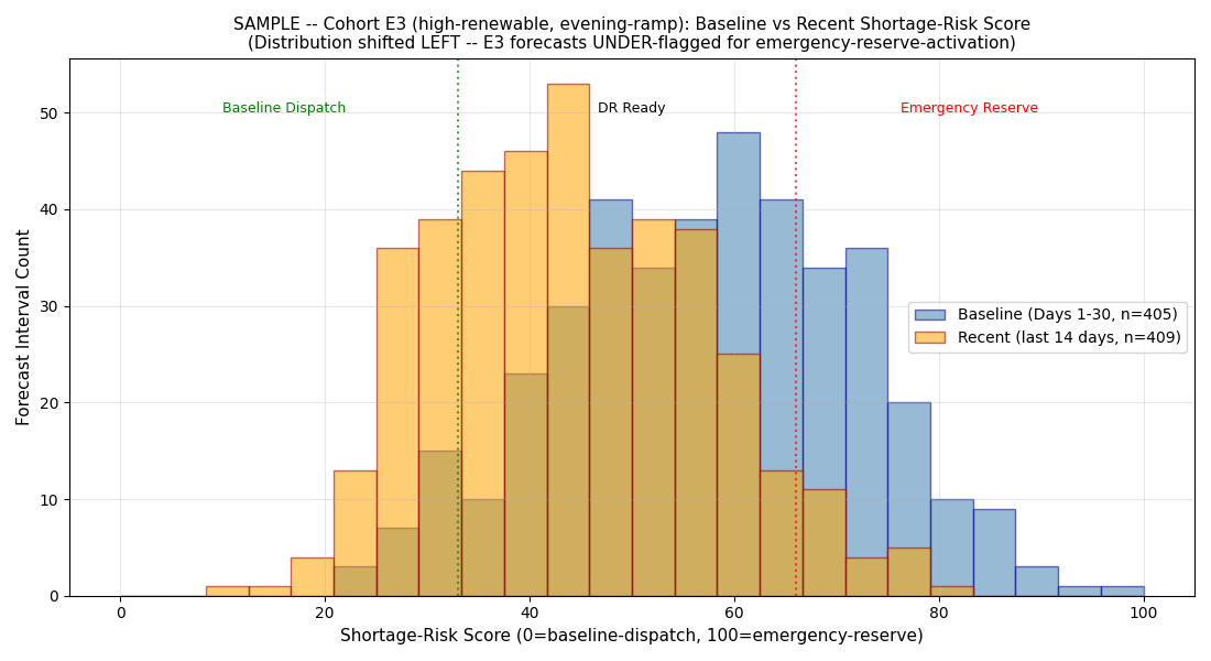
The how. Where Chart 1 shows when the E3 line dropped, this chart shows how the E3 shortage-risk score distribution shape shifted. Mass moved left, out of the emergency-reserve-activation lane.
What you are looking at
- X-axis: shortage-risk score (0 to 100)
- Y-axis: density of forecast intervals at that score for zone E3
- Blue distribution: baseline window (first 30 days), what E3 scoring normally looks like
- Orange distribution: recent window (last 30 days), what E3 scoring looked like at Snapshot time
- Vertical line at score 67: threshold for routing to emergency-reserve-activation lane
What the shape shift means
The orange distribution's mass has moved left compared to the blue distribution. Three things are happening at once:
- The peak (mode) drops. The most common E3 shortage-risk score used to sit near the emergency-reserve threshold; now it is well below.
- The right tail shrinks. Fewer E3 forecast intervals score above the emergency-reserve threshold.
- The left tail grows. More E3 intervals score in the baseline-dispatch range.
What KL-divergence quantifies
Kullback-Leibler divergence measures how different one distribution is from another. Values:
- KL < 0.05: the same distribution (random noise)
- KL 0.05-0.2: mild shift, monitor
- KL 0.2-1.0: significant shape shift, flag as event
- KL > 1.0: substantial shape shift, high-severity event
- KL > 2.0: distributions are almost non-overlapping — the operating conditions the AI is scoring are behaviorally different from the operating conditions it was trained on
The sample's E3 KL-divergence hit 0.526 on Day 44 and stayed above threshold. E5 hit 2.394 on Day 65 and 1.727 on Day 79. Two zones firing at once, on independent windows, is what forces the C determination.
The operational + regulatory read
The next chart
The baseline-vs-recent chart shows how the E3 distribution shifted. The lane-rate chart shows the operational consequence: which lane are E3 intervals actually getting routed to now vs baseline.
$499 Snapshot. 3 business days.
Same shape-analysis for your operator's actual AI surface + full analysis report.
Buy $499