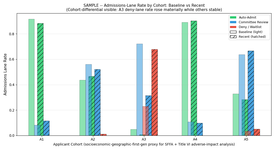
Chart 3 — lane rate per applicant group, baseline vs recent
The chart with the operational and regulatory bite. Where score-distribution shifts translate into actual applicant routing. A3 deny-or-waitlist lane rose 23% to 68%. Other applicant groups stable. That is the exact adverse-impact signature Title VI, SFFA, and state AGs look for.
What you are looking at
- Grouped bars per applicant group (A1 / A2 / A3 / A4 / A5)
- Three colors per applicant group: Auto-Admit (green) / Committee Review (blue) / Deny-or-Waitlist (red)
- Left cluster: baseline (first 30 days) — the "normal" routing per applicant group
- Right cluster: recent (last 30 days) — the current routing per applicant group
What the chart shows
- A1, A2, A4 — lane rates roughly unchanged between baseline and recent.
- A5 — some drift, primary source of the secondary event stream.
- A3 — deny-or-waitlist rate rises sharply (23% baseline → 68% recent). Auto-admit rate falls. Committee-review rate absorbs some, but most of the shift lands in deny-or-waitlist.
- The differential exists primarily for A3 (with a secondary A5 signal). Other applicant groups are unaffected.
Why aggregate metrics missed it
Because A3 is one applicant group among five, and A3 share was growing while the differential was compounding, the aggregate admission-rate barely moved. The overall diversity dashboard (with post-hoc adjustments) also stayed stable. That is why the enrollment-management stack stayed green. Aggregate metrics are structurally blind to group-differential patterns, and group-differential patterns are inherently what disparate-impact analysis is built to surface.
The signal that fired the A/B/C determination
The exhibit-quality read
This chart is what a plaintiff's expert witness, state AG investigator, or OCR investigator asks the institution for first. It is also what the institution's General Counsel should have on file before either lands — because the same chart, in the institution's hand, tells a different story:
$499 Snapshot. 3 business days.
Same lane-shift chart for your institution's actual AI surface + full determination + 3 fix-first items.
Buy $499