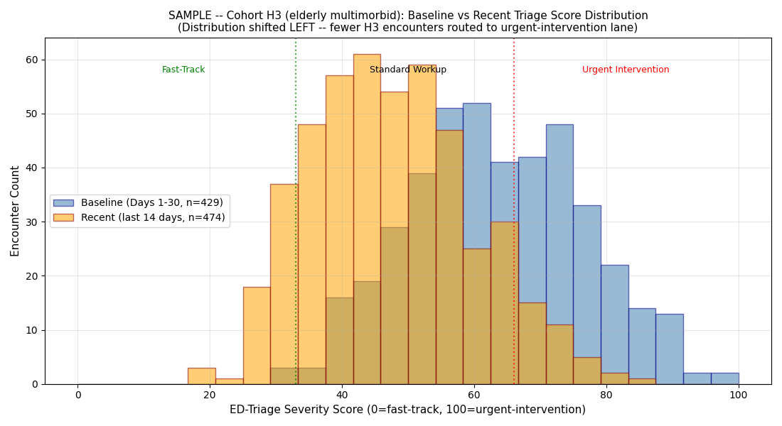
Chart 2 — H3 baseline vs recent distribution
The how. Where Chart 1 shows when the H3 line dropped, this chart shows how the H3 score distribution shape shifted. Mass moved left, out of the urgent-intervention lane.
What you are looking at
- X-axis: triage severity score (0 to 100)
- Y-axis: density of encounters at that score for H3
- Blue distribution: baseline window (first 30 days), what H3 scoring normally looks like
- Orange distribution: recent window (last 30 days), what H3 scoring looked like at Snapshot time
- Vertical line at score 67: threshold for routing to urgent-intervention lane
What the shape shift means
The orange distribution's mass has moved left compared to the blue distribution. Three things are happening simultaneously:
- The peak (mode) drops. The most common H3 score used to be near the urgent threshold; now it is well below it.
- The right tail shrinks. Fewer H3 encounters score above the urgent-intervention threshold.
- The left tail grows. More H3 encounters score in the fast-track range.
What KL-divergence quantifies
Kullback-Leibler divergence measures how different one distribution is from another. Values:
- KL < 0.05: the same distribution (random noise)
- KL 0.05-0.2: mild shift, monitor
- KL 0.2-1.0: significant shape shift, flag as event
- KL > 1.0: substantial shape shift, high-severity event
- KL > 2.0: distributions are almost non-overlapping — the population the AI is scoring is behaviorally different from the population it was trained on
The sample's H3 KL-divergence hit 2.108 on Day 44 and 2.953 on Day 86. That is far above threshold, and it stayed there.
The clinical + regulatory read
The next chart
The baseline-vs-recent chart shows how the H3 distribution shifted. The lane-rate chart shows the operational consequence: which lane are H3 patients getting routed to now vs baseline.
$499 Snapshot. 3 business days.
Same shape-analysis for your hospital's actual AI surface + full analysis report.
Buy $499