Chart 1 — rolling mean readiness-risk score by asset group
The chart your Program Manager and Chief Engineer should look at first. Where the silent F3 divergence begins, in one visual.
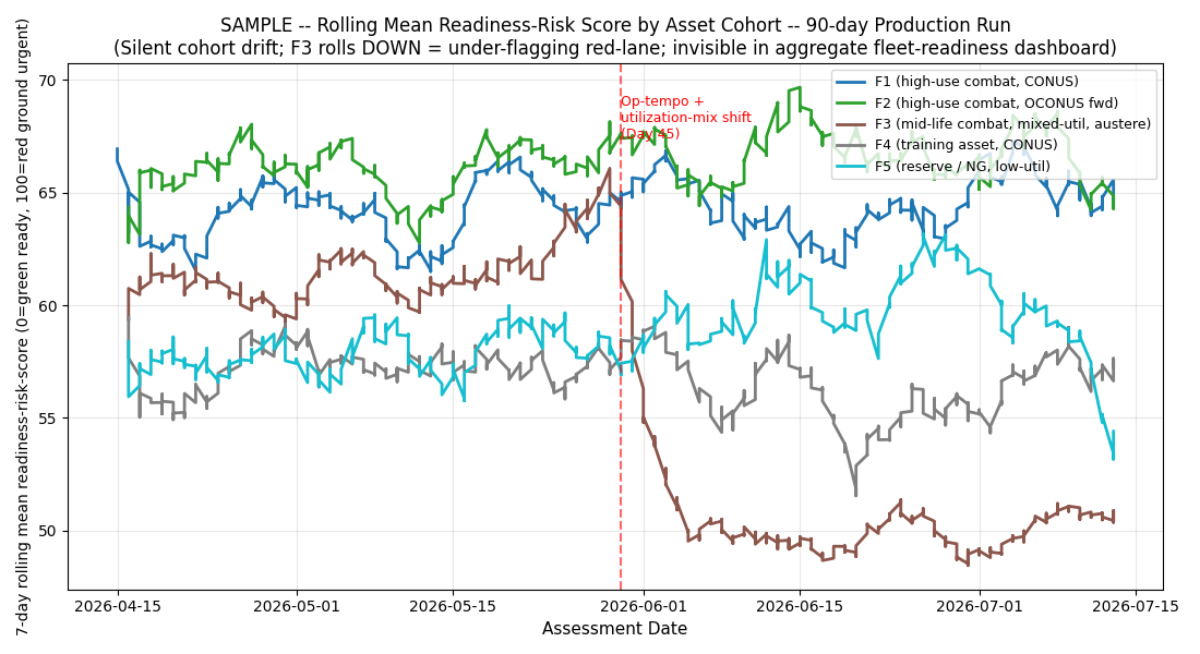
What you are looking at
- X-axis: Day 1 through Day 90 of the audit period
- Y-axis: 7-day rolling mean of the AI's readiness-risk score (0-100 scale)
- Each line: one asset group (F1 = new low-cycles, F2 = mid-life garrison, F3 = mid-life combat austere-environment, F4 = late-life high-cycles, F5 = training / T&E)
- Baseline window: the first 30 days establishes what "normal" looks like per asset group
What the eye sees
Four asset groups stay roughly parallel across the 90 days. One asset group — F3 — drops. The drop begins around Day 44, and it does not recover. The line separates from the pack in the DOWNWARD direction — F3 scores are trending LOWER (less risky) at exactly the moment operating conditions say they should be trending higher.
This is the pattern a maintainer-in-the-hangar instinctively recognizes: the F3 stream got harder while the AI decided it got easier. The 26 percentage-point red-lane collapse is the follow-on operational consequence.
What the sensor fires on
The sensor is not looking at the eye's pattern. It is running four quantitative thresholds against each 7-day window per asset group:
- Mean-shift: is the 7-day mean > 1.5 standard deviations from baseline mean?
- Variance-ratio: is the 7-day variance > 1.5x baseline variance?
- KL-divergence: is the shape divergence between baseline and current distribution > 0.2?
- Group-differential: is the max cross-group shift > 12%?
Day 44 fires F3 KL-divergence 1.275 (over 6x the threshold). Day 58 fires F3 KL-divergence 2.101 (over 10x the threshold). The pattern the eye sees is the pattern the sensor quantifies.
What accident-investigation boards + GAO care about
The chart also tells the counterfactual story: had this monitoring been in place operationally, the drift window would have been ~7-14 days rather than 45+.
The next chart
The rolling-mean chart shows when. The baseline-vs-drifted chart shows how the F3 distribution shape shifted.
$499 Snapshot. 3 business days.
Same 3-chart set for your program office's actual AI surface + full analysis report.
Buy $499